The RHCC Logo
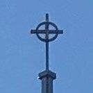
(First image: our steeple’s cross)
(Second image: our church’s logo)
I thought it’d be helpful to provide some insight into the design of our church’s logo, which, as you can see, was inspired by the cross that sits atop our sanctuary.
The symbol of a cross is (obviously) a representation of the crucifixion of Jesus Christ. As early as 204 AD, we read of Christians tracing the sign of the cross on their foreheads in worship, and it has been used in the iconography of the disciples of Christ since at least the turn of the third century, even being referred to in writings as “the Lord’s sign”. Since then, the cross has become a unifying symbol with which Christians from all denominations and cultures readily associate.
Crosses that include a ring (a.k.a. a “nimbus”) became common as early as the early Middle Ages and are now known as Celtic crosses. The ring, or halo, is meant to communicate Christ’s divinity, pointing us to the Trinity.
The triangular cutout at the bottom of the cross on our logo is both (1) representative of the mount atop which the cross is affixed to our sanctuary, thus picturing that our grounding is in Christ’s substitutionary work on our behalf (“On Christ the Solid Rock I Stand”), and (2) meant to be an arrow pointing us to Christ, and thus calling us to “look to the cross”, as we do every time we close our services on Sunday mornings.
More could be said, as much goes into modern logo design (e.g. it should be simple, employ only 2-3 colors, and be mostly self-explanatory), but these are the main factors that went into the design. May it continually be a reminder for us all to “look to the cross” daily!